Design Systems That Scale Across Products
Enterprises rarely ship a single app anymore. They launch suites mobile, web, internal tools, marketing surfaces often built by distributed teams. A scattered library of buttons won’t hold that together. What you need are Design Systems That Scale Across Products not just reusable components, but an operating model that spans brands, platforms, accessibility, and velocity.Material Design
In this guide, we break down the architecture, governance, and delivery practices that make Design Systems That Scale Across Products reliable for cross-functional teams, even as requirements evolve weekly. You’ll leave with patterns, governance models, and an adoption playbook to build Design Systems That Scale Across Products that endure.
What “scaling” really means for design systems
Scaling isn’t simply more components. Design Systems That Scale Across Products deliver.
-
Consistency at speed
Shared tokens and components create uniform UX without stifling experimentation.
-
Configurability
Brands, theming, and accessibility variants coexist without duplication.
-
Extensibility
New product teams can compose patterns without forking the system.
-
Observability
Health, usage, and contribution pipelines make the system measurable.
A scalable system reduces time-to-consistent-UI while allowing time-to-differentiate where it matters.
North-star architecture for Design Systems That Scale Across Products
To architect Design Systems That Scale Across Products, adopt a layered model
Foundations (Design Tokens)
-
Core tokens
Color, type ramps, spacing, radius, elevation, motion.
-
Semantic tokens
Map “brand/intent” to core (e.g., color.bg.success)

-
Theming
Light/dark, high-contrast, brand themes.
-
Delivery
Store tokens in a single source (JSON/Style Dictionary) and export to CSS variables, Android/iOS resources, and Figma styles.
Primitives (Base Components)
-
Buttons, inputs, lists, dialogs, toasts—built on tokens only.
-
No business logic, minimal props, and strict accessibility contracts.
Composites & Patterns
-
Navigation bars, table+filter+bulk actions, form wizards, stepper checkouts.
-
Reference designs, flow charts, and code recipes bundled with accessibility notes.
Product Extensions
-
Product-specific layers: analytics dashboards, checkout modules, or content editors.
-
Extensions depend on primitives/composites but never redefine tokens.
This layered approach keeps Design Systems That Scale Across Products flexible while preserving a stable core.
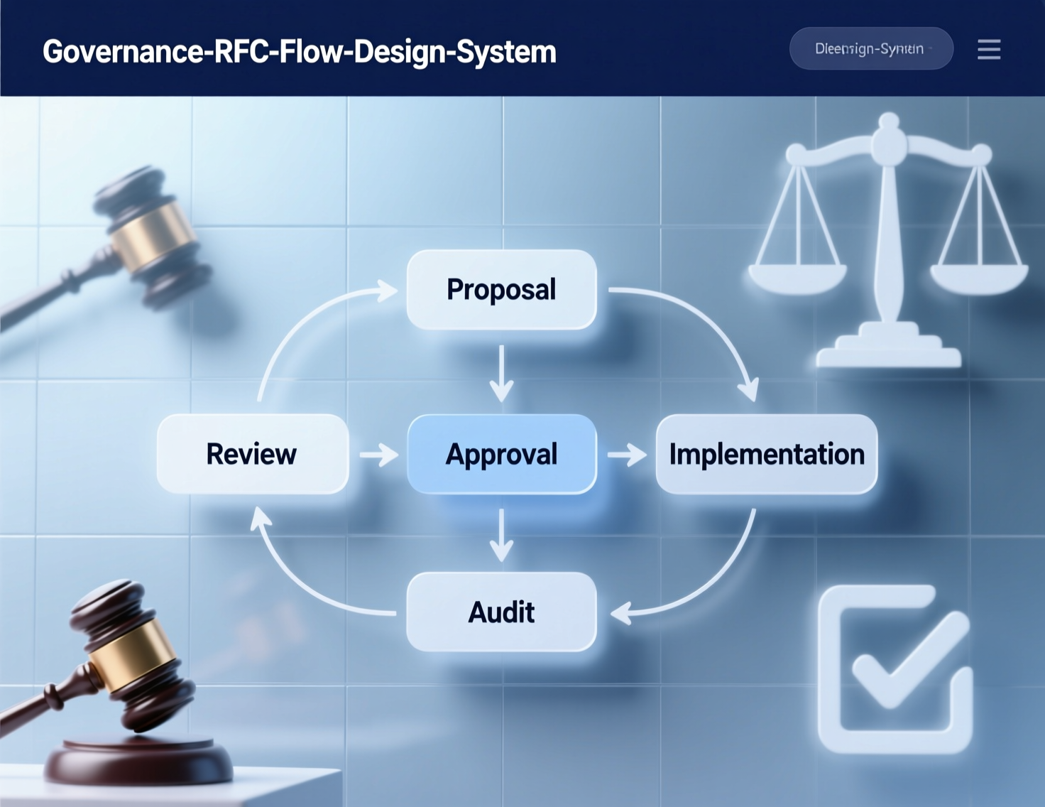
Governance that doesn’t slow teams
Successful Design Systems That Scale Across Products balance autonomy with alignment.
Operating model
-
Core team
Design systems engineers + design ops + accessibility lead. Own tokens, primitives, CI/CD, documentation.
-
Guild/Working group
Representatives from product teams meet bi-weekly to triage requests and review proposals.
-
Contribution model
RFCs with acceptance criteria (a11y, docs, tests, usage examples).
-
Release channels:
Canary for early adopters, stable for the org.
Decision guardrails
-
Adopt → Adapt → Invent: Prefer using an existing pattern; adapt only with data; invent as a last resort.
-
One-way doors: Token name changes or breaking props require migration scripts and deprecation windows.
-
Accessibility gates: Block merges if color contrast, focus order, or keyboard traps fail.
Multi-brand and theming at enterprise scale
Many organizations operate several brands or “brand tiers.” Design Systems That Scale Across Products should support.
-
Theme packs
Brand tokens layered over core semantic tokens.
-
Mode variants
Light/dark/high-contrast and platform-specific density.
-
Locale-aware typography
Scripts, font fallback stacks, and variable font axes.
Implementation tip: ship brand-theme packages (@org/ds-theme-omega, @org/ds-theme-zen) that expose tokens and CSS variables. Product apps switch themes via a single provider, making Design Systems That Scale Across Products practical for rebrands or seasonal campaigns.
Accessibility as a first-order constraint
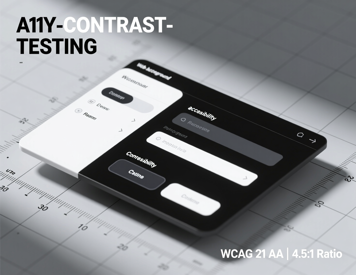
Accessibility cannot be bolted on later. Bake WCAG 2.2 AA into tokens and primitives.
-
Tokenized color contrast; automated checks in PR CI.
-
Keyboard-first composables; visible focus rings.
-
Motion-reduced transitions controlled via prefers-reduced-motion.
-
Screen reader guidance baked into docs for each component.
Embedding accessibility makes Design Systems That Scale Across Products consistent for every user.
Tooling: make the system observable
If you can’t see it, you can’t scale it. Add observability to Design Systems That Scale Across Products.
-
Automated visual regression (Chromatic/Playwright): per-component baselines.
-
Component analytics: optional, privacy-safe signals to learn which variants ship.
-
Dependency graph: understand blast radius of token changes.
-
Scorecards: each product gets an adoption score (tokens used, primitives, a11y pass rate).
The cross-functional delivery pipeline
Design Systems That Scale Across Products require an end-to-end pipeline:
Design source of truth: Figma library → tokens plug-in → JSON.
Token build: Style Dictionary/Token Transform → platform exports.
Component build: TypeScript + Storybook; a11y unit tests; snapshot tests.
Docs site: MDX recipes, live code sandboxes, design guidelines, and do/don’t patterns.
Versioning & releases: Semantic-release with conventional commits; changelogs auto-generated.
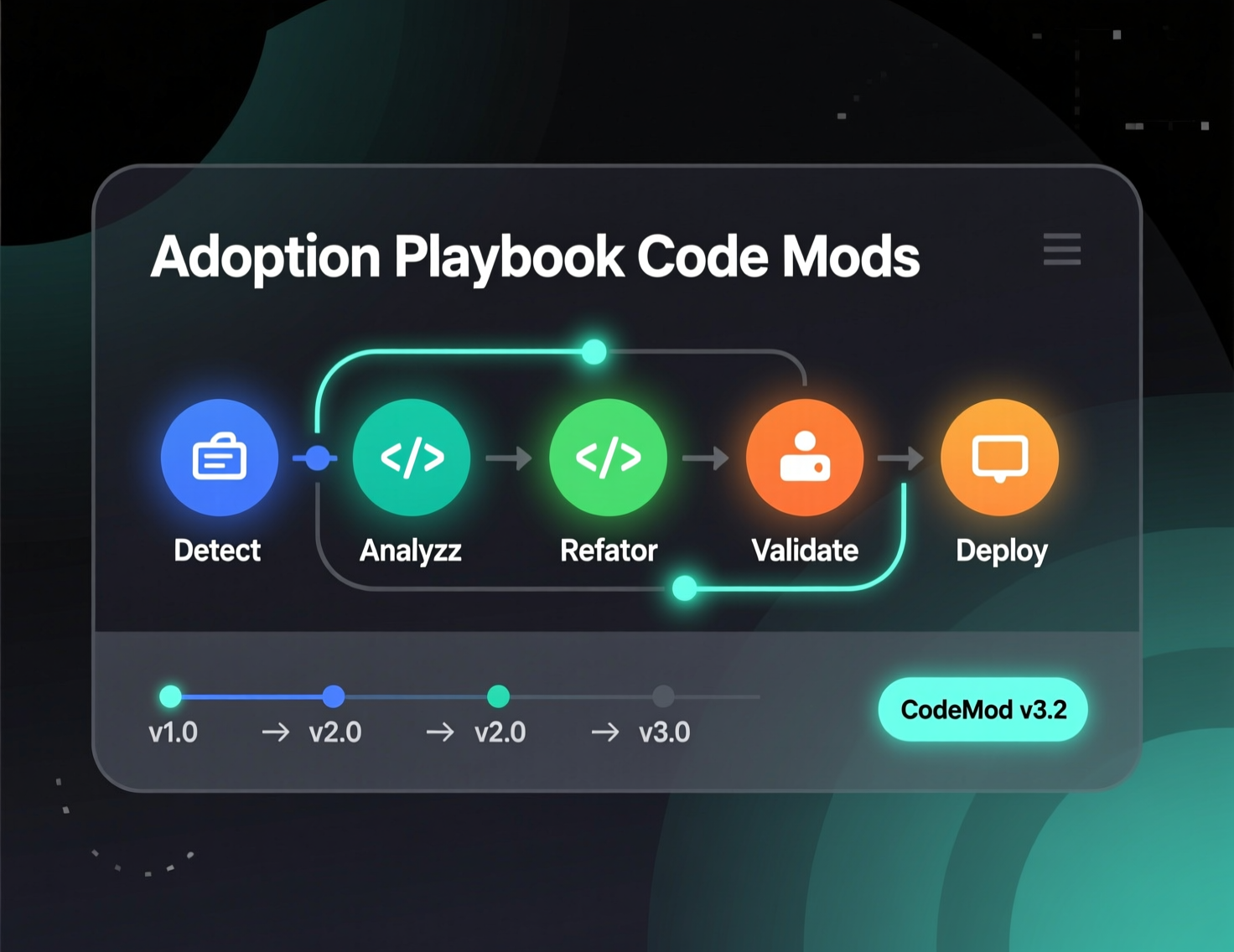
Adoption kit: migration codemods, ESLint rules, and usage lints.
Case study #1: Fintech suite unifying five products
A fintech with five web apps had fragmented UI and mounting maintenance. They created Design Systems That Scale Across Products by.
-
Converting brand guidelines to semantic tokens and supporting high-contrast mode.
-
Rewriting inputs, buttons, and tables as primitives; shipping a “payments pattern” with receipts and reconciliation.
-
Releasing monthly canaries and running codemods for prop renames.
Outcome (estimate VERIFY LIVE)
New screens assembled 30–40% faster and accessibility defects dropped consistently release-over-release. The key was a contribution model that let product squads co-own roadmaps for Design Systems That Scale Across Products.
Case study #2: SaaS platform with embedded analytics
A B2B SaaS needed complex date/time and chart patterns across web and desktop. They built Design Systems That Scale Across Products around:
-
Data-viz tokens (categorical palettes, semantic status colors).
-
A chart primitive wrapped around a standard library with consistent a11y.
-
A pattern called “explore panel” standardizing filters, search, and saved views.
Outcome (estimate VERIFY LIVE): churn dropped as teams shipped coherent analytics features; Design Systems That Scale Across Products also simplified onboarding for new engineers.
Measuring success (and knowing when to say no)
Track these metrics.
-
Coverage: % of UIs built using primitives/patterns.
-
Cycle time: design-to-dev handoff to code merged.
-
Defect rate: visual/a11y regressions per release.
-
Duplication: count of bespoke components vs. approved variants.
Say no when a requested variant undermines token semantics or creates a one-off pattern that can’t be generalized. Design Systems That Scale Across Products thrive on curating fewer, better options.
Common pitfalls and how to avoid them
-
Token sprawl
Lock a naming taxonomy ([category].[role].[state]).
-
Forking for speed
Provide escape hatches (slots/overrides) so teams don’t fork.
-
Docs drift
Treat docs as code; PRs must update MDX examples and usage notes.
-
Brand-first overrides
Push changes into semantic tokens instead of CSS overrides.
-
“Component zoo” anti-pattern
Every component must be tied to a pattern and a user task.
Adoption playbook for new teams
Kickoff workshop
Introduce Design Systems That Scale Across Products, tokens, and role-based color.
Inventory & map
Run a 2-hour audit of existing UI against primitives.
Adopt three patterns first
(e.g., form wizard, data table, toast).
Codemod sprint
Migrate old props; fix a11y issues flagged by ESLint rules.
Celebrate releases
Changelog highlights, usage dashboards, shout-outs to contributors.
Advanced patterns worth standardizing
-
Command palettes with keyboard search and action previews.
-
Editable data grids with virtualized rows and inline validation.
-
Multi-brand theming with CSS variables and design token “scopes.”
-
Micro-frontend safe components using web components or module federation.
-
Offline-aware inputs with optimistic UI and retry toasts.
These make Design Systems That Scale Across Products compelling for product teams who need real speed and reliability.
To Sum Up
The purpose of Design Systems That Scale Across Products isn’t to freeze the UI—it’s to make change cheap. When tokens are the source of truth, primitives are rock-solid, and governance is collaborative, teams ship faster with fewer defects. Treat the system like a product: measure it, market it, and maintain it. Invest in accessibility and theming early, build an honest contribution model, and keep your docs alive. Do this, and you’ll have Design Systems That Scale Across Products that endure across brands, platforms, and years.
CTA
Ready to stand up Design Systems That Scale Across Products in your org? Start with a 2-week token + primitives pilot. I can help you design the operating model, author tokens, and ship your first release candidate let’s talk.
FAQs